| Meet the Judges | ||
 |  |  |
| Craig Miller, OD, owner of Eye Columbus, in Columbus, Ohio | Teri Hung, OD, and Michael Hung, OD, owners of Eye Elements in Dunwoody, Ga. | Sharokh Kapadia, OD, owner of St. John’s Eye Associates in Ponte Vedra, Fla. |
When you envision your dream office, what do you see? More space and light? The latest OCT machine in its very own testing area? A ruthlessly organized contact lens fitting room? Optometrists from across the country shared their dream offices come to life for Review of Optometry’s 2015 Office Design Contest, and the winners prove that different is often a very good thing.
   |
All of our contestants showed dedication to both their patients’ needs and aesthetic appeal, but three practices stood out for their creativity and functionality, according to our expert judging team.
Color took center stage in this year’s contest. The winner and both runners up incorporated bolder color palettes to add a little spice to the daily routine. But aesthetics wasn’t the only factor that set these contestants apart for our judges. Entries were also judged based on function, ergonomics and incorporation of optometric equipment, and the winners came through with much-needed upgrades, staff-friendly workspaces and patient-centered layouts.
See how three practices blended the latest technology with unique office designs to provide both their patients and staff with the ultimate optometry experience.
Winner
Specs Downtown, Florence, Ala.Barry Basden, OD, owner
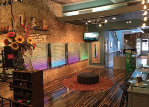
Dr. Basden had no idea what he was getting into when he decided to renovate his 7,400sq.ft. office space in Florence, Ala. Once a dry goods store, tailor shop, bank and then an attorney’s office, the building’s original brick walls were hidden beneath layers of older material—including horsehair plaster. But stripping everything down to find the original character of the building paid off for Dr. Basden.
 | |||
“This is a very creative and artistic space; every room has so many different design interests,” said contest judges Teri and Michael Hung, both ODs. “By retaining the historic nature of the building with the use of traditional brick and wood flooring/framework, the owners were able to maintain warmth in a very art deco space.”
Patients enter into a cozy and inviting waiting area with original hardwood floors and teal walls that contrast nicely with the practice’s red logo and exposed brick.
 |
  |
“The choice of materials and colors provides a funky retail environment, which is perfect for a designer eyewear retail environment,” said contest judge Craig Miller, OD. “There is nothing sterile about this practice.”
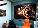
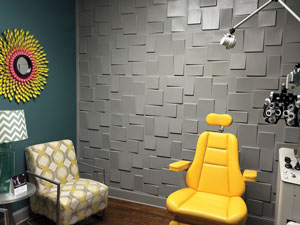
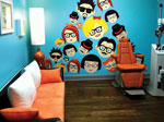
It’s not all fun and games in Dr. Basden’s practice, however. Each of his exam rooms is equipped with state-of-the-art equipment, including electronic visual acuity panels and a slit lamp camera. He did, of course, add a little character to his exam rooms—patients won’t soon forget the experience if they were seen in the plane, hipster or block exam rooms.
“‘They brought the fun back into optometry!’ was the first thing that came to mind when I saw the photos of this practice,” said contest judge Sharokh Kapadia, OD. “Their attention to detail is second to no other practice I have seen, from the unique and eclectic exam rooms, to the cool ‘trophy room’ and the functional loft meeting area.”
1st Runner Up
Midwest Eye, Downers Grove, Ill.Todd A. Robert, OD, owner
 |
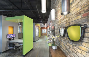 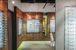 |
“The fun colors, varying textures, modern lighting, brick wall and lofty ceiling all bring attractive visual interest into this smart office design,” said Drs. Teri and Michael Hung.
“I like the non-traditional use of materials and color that make this environment one that stands out,” Dr. Miller added.
But the judges were raving about more than just the colors. The optical kiosks spread throughout the front office provide an unusual solution for the need for patient privacy in such an open space. “I like the clean, open-concept feel to this practice,” said Dr. Kapadia. “Purchasing eye wear in a private kiosk type of setting is a real distinguishing plus that their patients must appreciate.”
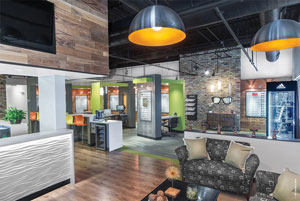 |
| Dr. Robert chose toremove the drop ceiling, giving the office a “loft” feel. |
 |
The entire office is wheelchair accessible, and the front desk is readily identifiable and offers multiple counter heights for staff and patient comfort. Dr. Robert and his design team took into account the technology needs of the younger generation as well and incorporated a data bar to give patients and representatives much-needed space to stay connected.
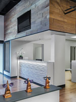 |
“Having a data bar to recharge phones and computers can be very accommodating to patients in today’s modern mobile world,” said Drs. Teri and Michael Hung.
Added to these front office perks is a well-organized back office with updated diagnostic tools.
Above and beyond the patient-friendly design and high-tech testing, patients are struck by their optometrists’ dedication to the profession. Photos of their mission trips line the hallways, adding aesthetic appeal and a powerful conversation starter.
2nd Runner Up
LaFollette Eye Clinic and The Eyewear Gallery, LaFollette, Tenn.
Andrew Howard, OD, and Elizabeth Howard, OD, owners
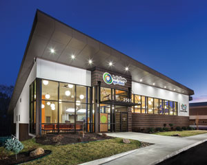
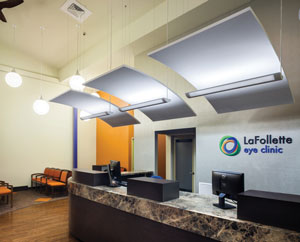
Drs. Andrew and Elizabeth Howard made their dream office a reality when they opened a new office in LaFollette, Tenn. The theme, “A Celebration of Vision,” helped turn the 10,000 square foot building into an efficient, patient-friendly and aesthetically stunning optometric practice.
  |
“It’s a comfortable, beautiful and happy place,” said Dr. Andrew Howard. “It’s a joy to offer this space to our staff and community.”
The exterior’s picture windows provide patients a preview of the interior and the lighting that changes color seasonally. The color scheme is incorporated throughout the space and does more than provide a clean, modern look.
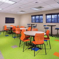
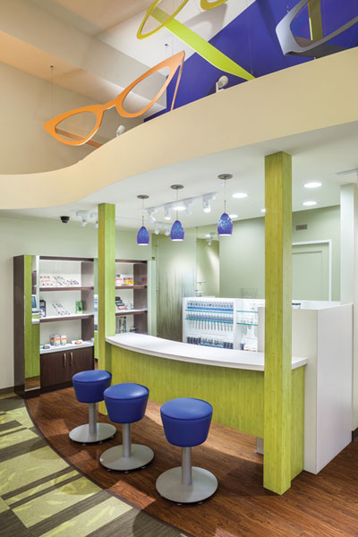
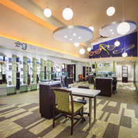
“The color palette of bright blues, oranges and greens adds life throughout the space, while still representing the logo colors of the practice,” said Drs. Teri and Michael Hung.
The colors, incorporated into the flooring, were designed to subtly define spaces as well, according to Dr. Andrew Howard. They help patients navigate the office loop from the lobby, through testing and exams to the eye wear gallery without backtracking.
And with 16 exam rooms, patient flow was bound to pose a problem. But a unique layout consisting of four pods with four rooms each ensures staff efficiency and patient comfort.
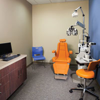
While Drs. Andrew and Elizabeth Howard wanted the office to be a work of art, they also wanted to create the ultimate patient experience. The seven new testing rooms allow space for workups, visual fields, preferential hyperacuity testing, VEP/ERG and topography. Two retinal imaging devices are strategically located in the middle of all pods, as retinal imaging is their most common diagnostic test. All of this means patients flow effortlessly through their appointment—and staff don’t waste steps either.
“This practice has a lot of presence—great curbside appeal with the inside having an open, bright and airy feel to it,” said Dr. Kapadia. “The owners have put a lot of thought into maximizing efficiencies and improving the patient’s experience from the use of 16 exam rooms organized into four separate pods and circular patient flow to the spacious and inviting optical.”
 |  |
 | |
 |

