- Barbara W. Wright, CID, president of Barbara Wright Design in Smyrna, Tenn.
- Patricia Bobilin, managing director, Southern Region, at Eye Designs in Collegeville, Pa.
- Lori Estrada, designer at Fashion Optical Displays in Paradise, Calif.
Q. I’m
not really crazy about our current, rectangular layout. But I’m not
exactly sure how to remedy the problem. Do you have any suggestions
about how we could make it more appealing and welcoming?

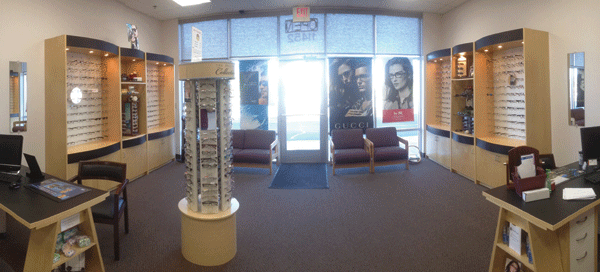
Does your office, like this one, have a case of the ‘blahs’? Start afresh by adding some color and rearranging the space to create a more cohesive display area.
Barbara W. Wright: This office is suffering from a bad
case of the “blahs.” All the colors are safe neutrals. Replacing the
stark white walls with a rich color (like sage green or brick red, for
example) and reupholstering the chairs in a patterned fabric that blends
with the wall color would make a big difference.
Patricia Bobilin: The space can very easily be transformed into something interesting by adding accent colors and finishes, improved lighting and additional walls. They need to work with a professional designer who can show them how to accomplish this goal
Lori Estrada: I’d
use the windows more for display, put in a nice seating area on one
side (perhaps with a refreshment bar), and use the other side of the
room for optical. This would give it a less “symmetrical” look and make
the display area more cohesive.
Q. My current optical layout has a lot of bottlenecks. Can you suggest any ways to improve the flow?
BW: Most
bottlenecks in the optical can be improved two different ways:
separating or duplicating. Duplicating how and/or where a patient pays
for services can fix payment bottlenecks. Adding another payment station
to the front desk is one way; but if a practitioner doesn’t have space
to do this, he or she can add a tablet with payment capabilities so
opticians can take payments right at the dispensing table.
PB:
To minimize bottlenecks, we typical look at the traffic patterns as
well as the function of the area to ensure there is ample space to move
freely through the office. For instance, if the check-out area is close
to the main corridor, we’d move it back to allow patients and staff to
move through the space.
Have you recently renovated your office?

Enter our 2013
“New Look” Office Design Contest, and you might see your office in the pages of Review!
Deadline for submissions is Sept. 27, 2013.
We also suggest using “transition” displays to attract and guide patients into the optical. And there must be a non-obstructive path into the optical so patients feel comfortable to wander in without having to be invited by optician or receptionist.
LE: There
should be a minimum of three feet around each dispensing table, per the
Americans with Disabilities Act. However, take into account that chairs
are moving in and out, and often there are additional chairs for a
spouse or guest of your patients, so the more space you can provide, the
fewer bottlenecks.
Using
certain stations for fitting and ordering frames and lenses, and other
stations for picking up and adjusting glasses, will maximize staff
efficiency and minimize extra traffic on the optical floor.
Q. I’m trying to figure out a better office layout, to improve the flow starting from the moment patients step into the office until they exit. Any suggestions?
BW: Patient flow issues are often difficult to solve and usually require changes in the floor plan. A professional designer can look at your floor plan and see possibilities in it that you won’t see on your own. (Better yet, engage an optical specialist to design your floor plan with great patient flow in the first place, so you don’t have to try to fix it later.)
PB: The best way to figure an improved layout with improved patient flow is to learn how the doctor likes to work and move patients through the office, which will identify any potential bottlenecks and lead to a layout that addresses the office’s proper design needs.
LE: In addition, it’s also good to assess your office flow from the perspective of your patients. It’s sometimes difficult to look at things differently when you are used to seeing the same thing day after day, so try walking into your practice as if you’re a brand new patient, and then ask yourself:
- Is it obvious where I should check in?
- Is there a staff person there to greet me immediately?
- Is there a clear path to the reception desk, or do I have to walk through a crowded waiting room and/or a busy optical to get there?
- Is there adequate seating? Note: Bench seats and couches are OK for families, but are not as practical as individual chairs. Couches take up more space and patients don’t generally like sitting next to people they don’t know.
- Are the hallways wide enough for foot traffic and wheelchairs?
- Is there a dedicated checkout area, preferably with some privacy, where patients are not discussing finances in front of others who are checking in?
The Pinterest page
Dr. Wittman created, “Optometry Office Ideas,” allowed her to store
design ideas from all over the web and easily access them in one place.
Now with nearly 600 followers, it’s also provided an excellent forum to
save and share those ideas with other ODs (
http://pinterest.com/caprockeyedoc/optometry-office-ideas).
She got inspiration not only from professional optometry design
companies, but also from local consignment shops, thrift stores,
discount retailers, and even eBay and Craigslist.
Dr.
Wittman’s design scheme actually came together after a great find for
just $600 at a local consignment store—a high-end custom design couch
with the packing slip still attached.
One of the most
eye-catching design pieces in the office was low on cost but high on
ingenuity.
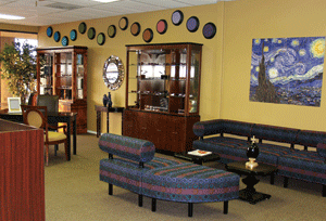
With a little black paint and some scrapbook paper, Dr.
Wittman transformed some wall clocks (which she bought on clearance from
Amazon) into wall art inspired by the Farnsworth D15 color blindness
test.
“Overall, it took a
lot of time and effort, but it was worth it,” she says. “We spent less
than $5,500 for our entire office décor—including couches, display
cases, desks, chairs, dispensary tables, artwork and various decorations
(but not including optometry equipment or our frame inventory).” —Colleen Mullarkey
Optometry Design on a Dime
When optometrist Cathy Wittman opened
her private practice in Lubbock, Texas, she had only a shoestring
budget for office design.

An excellent consignment store find, the high-end custom design couch above inspired the color scheme for the office. Dr. Wittman created the Farnsworth D15 wall art with some wall clocks, a little black paint, and scrapbook paper.
But with a little creativity and
resourcefulness, she managed to cut costs without sacrificing style.
“If
I had the funds, it would have been nice to have a design company do
it. But it was fun to shop around for deals, and getting plugged into
Pinterest was a great way to save ideas,” she says. “That’s what happens
when you have to do things on a budget—you have to look around and get
creative.”
“I wasn’t particularly drawn to
it, but my friend who’s good with design said I should take a look at it
because ‘it looks like waiting room furniture,’” she says. “We actually
put together a color scheme, just like an interior designer would do,
by color matching with the couch. I kept that color scheme in my purse
for months so that whenever I was out and about, I could use it to match
items.”

Dr. Wittman used some fabric swatches and paint chips to put together a color scheme that she carried with her so she could match items she came across while shopping.

