 |
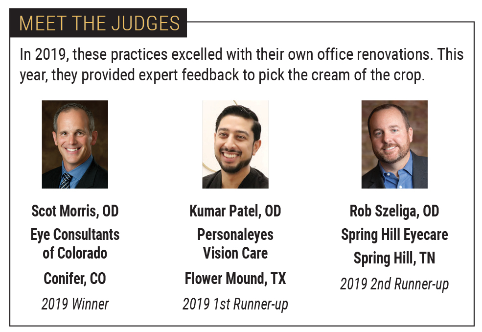
| Meet our judges. Click image to enlarge. |
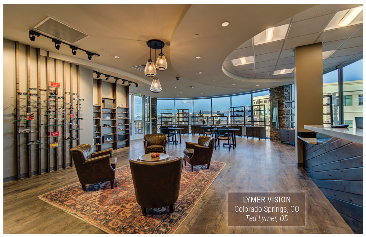
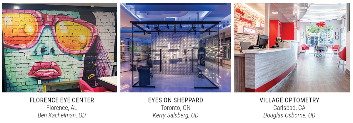
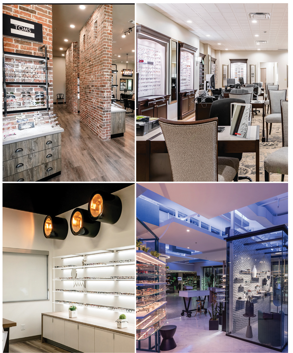
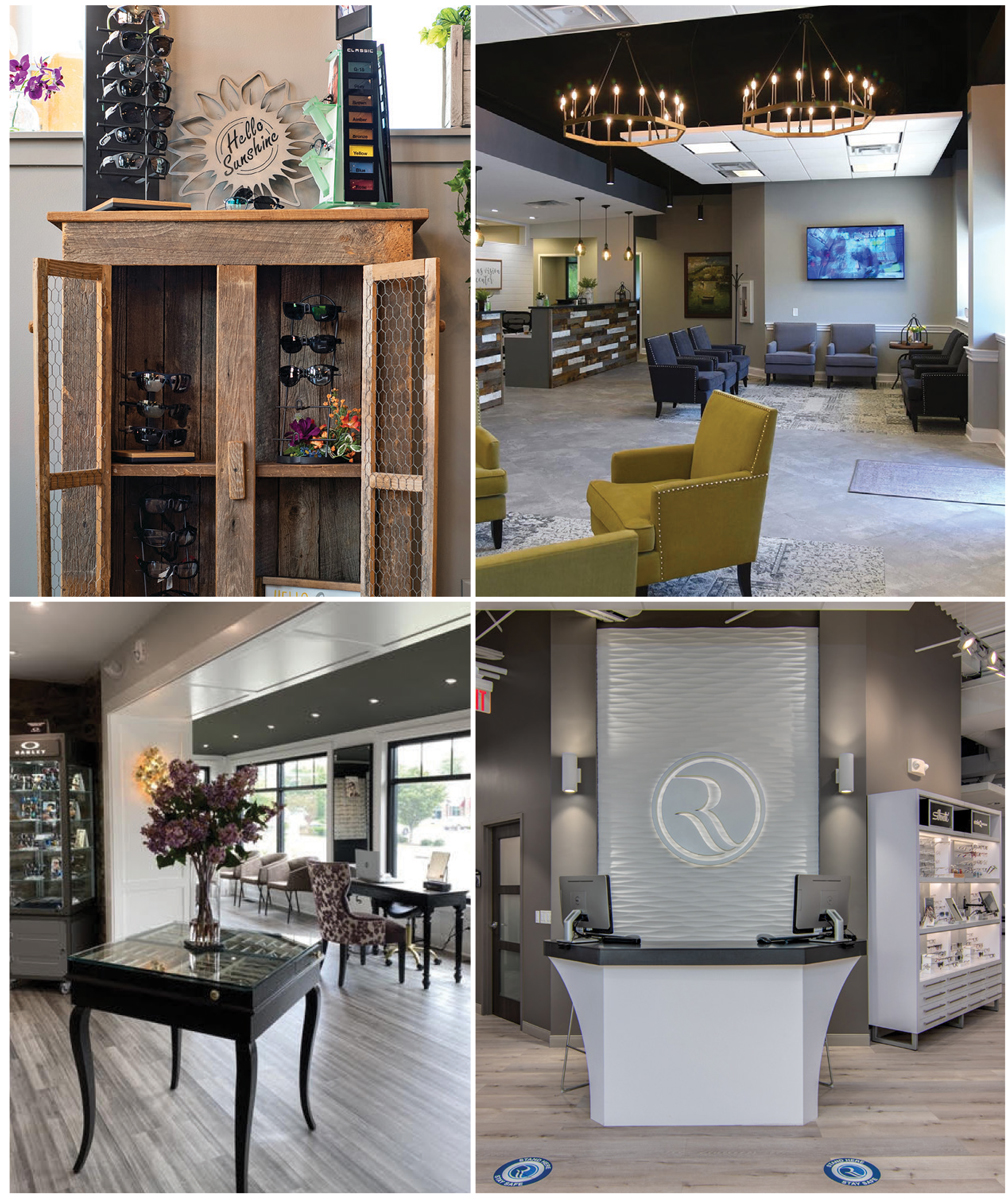
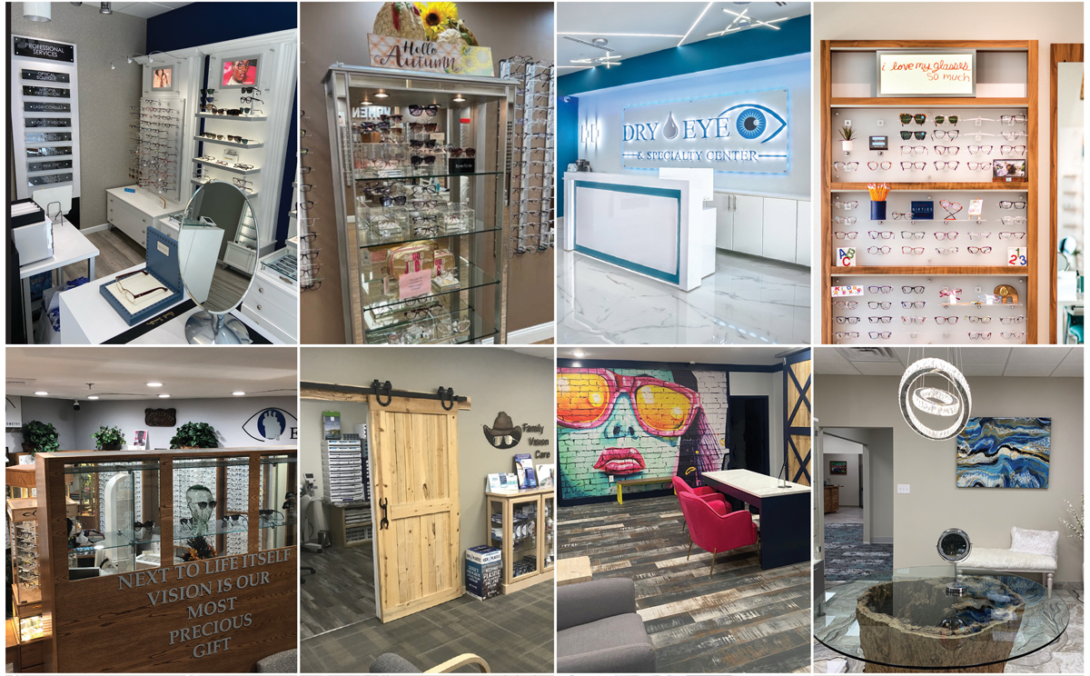
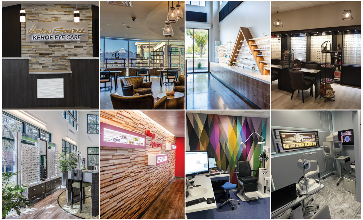
We always look forward to our biennial Office Design Contest and seeing optometrists from all over the country show off their style and, in some cases, their personality. This year, we were thrilled to have 24 practices enter the contest. The photo collage to the right includes one sample image from each participant. We wanted to showcase the breadth of contributions this time to show the range of what has been done over the past two years. There was a great deal of passion put into each space—we can’t wait for you to see the unique designs that may help you reimagine your own office space.
Peruse the collage, pick your faves, then scroll down for a celebration of this year’s winners!
 |
| Some of our entries for this year's contest. Click image to enlarge. |
 |
| Some of our entries for this year's contest. Click image to enlarge. |
 |
| Some of our entries for this year's contest. Click image to enlarge. |
 |
| Some of our entries for this year's contest. Click image to enlarge. |
 |
| Wada Optometry. Click image to enlarge. |
Winner
Wada Optometry, Anaheim, CA
Garrett Wada, OD
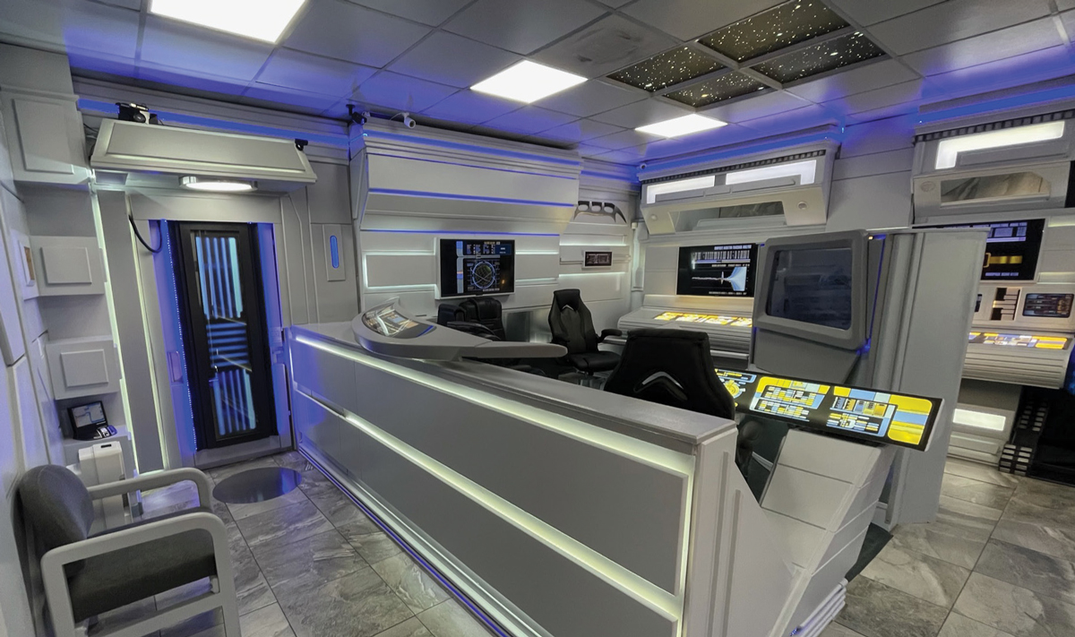
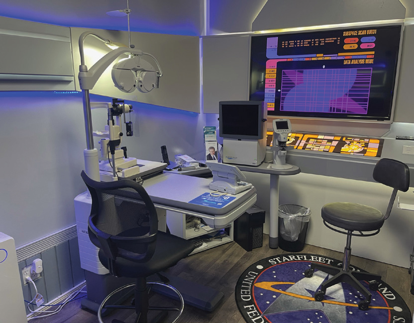
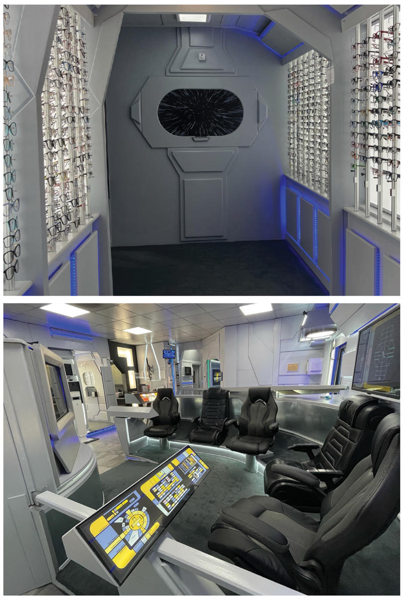
Dr. Garrett Wada took his love for Star Trek and turned it into a space that is as close to a replica of the television set as possible.
“I can’t imagine anybody as crazy as me,” Dr. Wada laughed about his concept. “I wanted to show people that an eye doctor doesn’t have to be in a regular office,” he says. “I try to make it fun and have creativity and imagination.”
 |
| Wada Optometry. Click image to enlarge. |
While judge Dr. Rob Szeliga noted he is not a fan of Star Trek, he is a fan of a well-executed theme. “The attention to detail from ceiling to floor is incredible—mission accomplished!” he explains. “The amount of effort it took to think of the design and actually execute it is amazing. The continuity of the along with its attention to detail was much appreciated,” says judge Kumar Patel, OD
You are immediately transported to the set of Star Trek the moment you walk into his office and almost forget you are walking into an optometrist’s office, but instead a spaceship. Dr. Wada says patients are truly amazed to see the inside after walking into an average-looking building. There’s a celestial ceiling, a bridge area with seats for patients and screens that plays Star Trek episodes.
 |
| Wada Optometry. Click image to enlarge. |
It all started when one of his former patients, whose occupation was building movie sets, suggested to Dr. Wada that he could do something “really cool” and different with his office space. Dr. Wada already had Star Trek memorabilia all over the office, but this patient helped take the theme to a whole new level.
Then Dr. Wada found another patient who has an eye for design and helped him build his practice into the ultimate Star Trek experience.
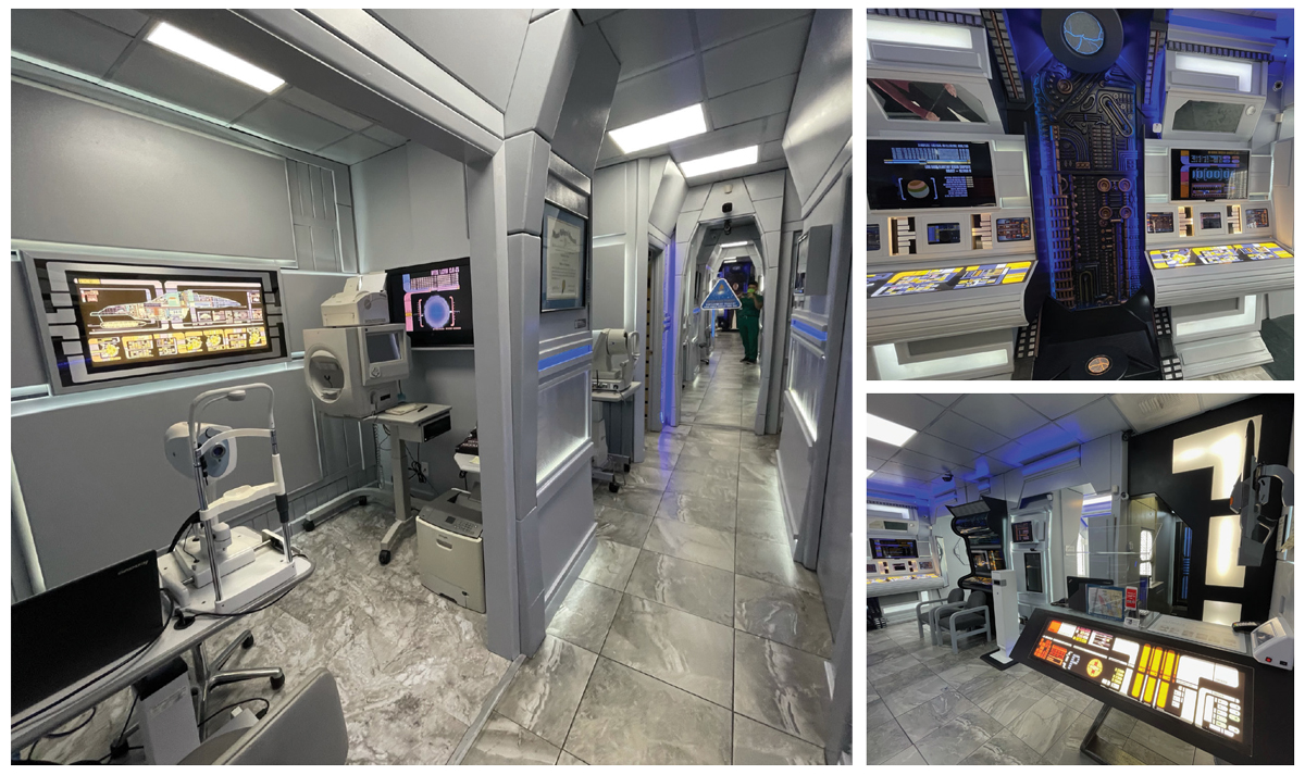
“I came into contact with an old prop manager for the Star Trek: Voyager series and purchased Borg panels and other accessories that were used on the set of the show and built the rest of the practice around it,” Dr. Wada explains.
He also added a lot of technology into the office to match the decor, went with automated instrumentations and all the computerized equipment to go along with the theme.
Dr. Wada has spent over $150,000 fixing his office and is continuously adding on to the 1,600sq. ft. space. This truly unique space is a one-of-a-kind experience. We certainly haven’t seen an office space ever quite like this.
“It feels like we’re in a spaceship,” Dr. Wada says. “Patients are excited when they come in. I’m very happy I ended up doing this.”
 |
|
Wada Optometry. Click image to enlarge. |
 |
| The Vision Center at Seaside Farms. Click image to enlarge. |
1st Runner Up
The Vision Center at Seaside Farms, Mount Pleasant, SC
Brad Bodkin, OD
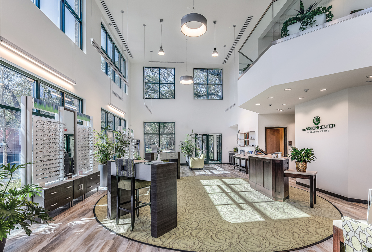
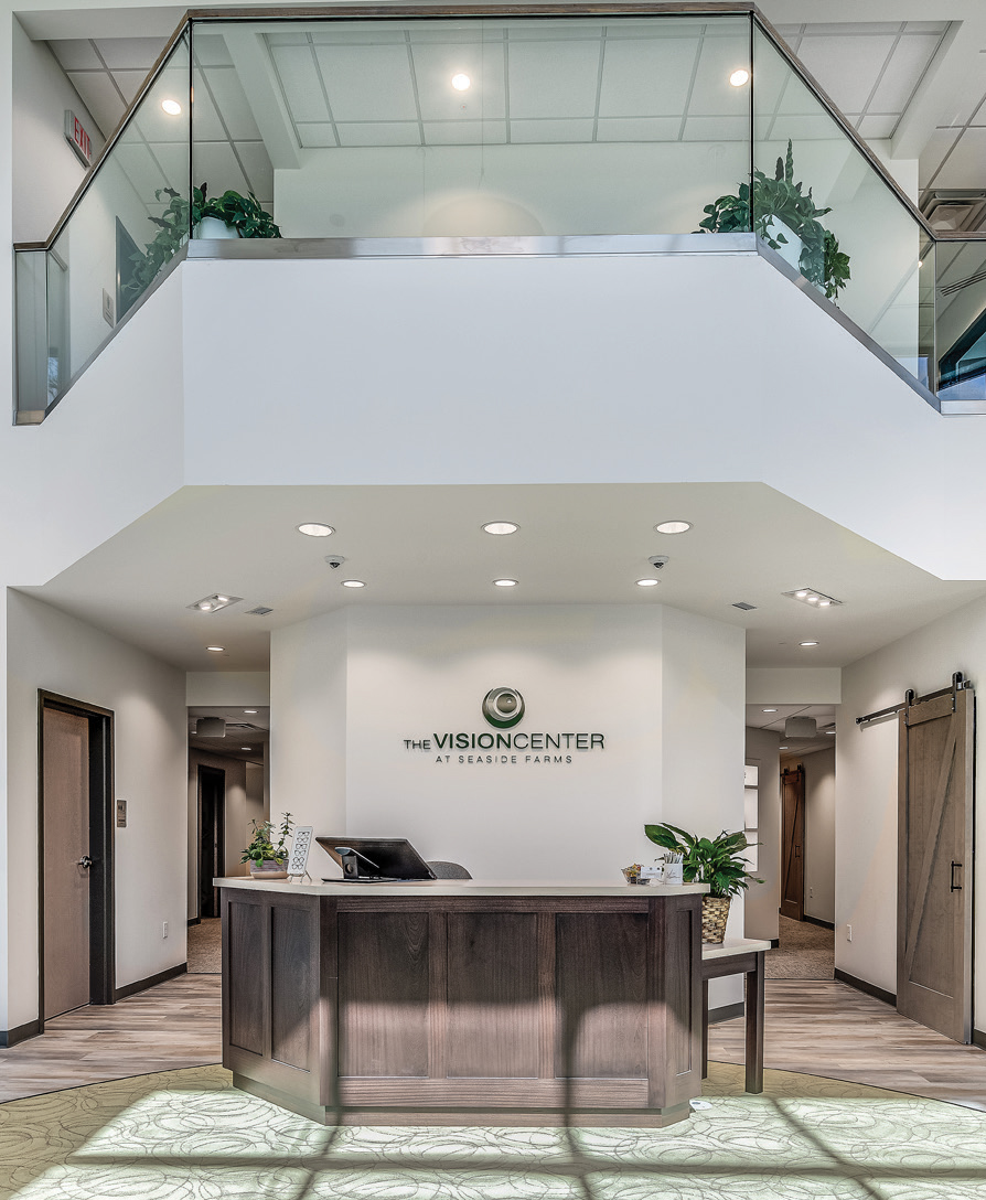
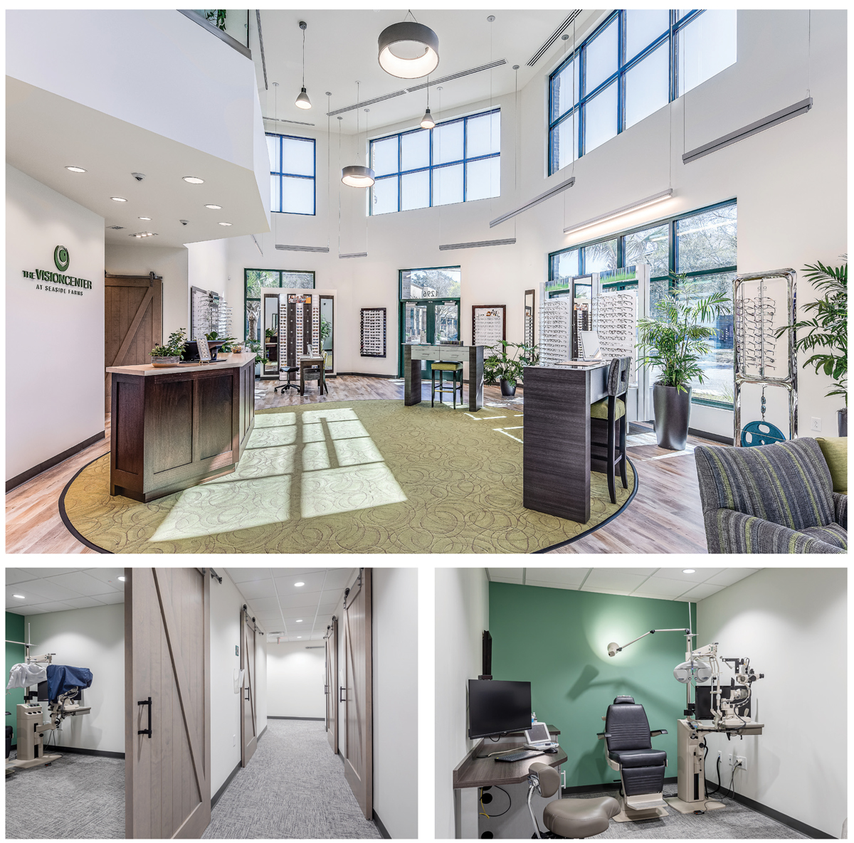
“Stylish Southern charm are the words that come to mind,” says Dr. Scot Morris, one of this year’s judges, about The Vision at Seaside Farms. “I love the mix of modern white walls and glass with the classic wood.” Adding to that charm is the use of large barn doors throughout the practice. Practice owner Brad Bodkin, OD, originally added them to help with efficiency, but they have been an aesthetic hit with patients, too.
“We used barn doors everywhere we could to make better use of our room space, but it has had the added benefit of being the most talked about aspect of our new building by patients,” Dr. Bodkin explains.
 |
| The Vision Center at Seaside Farms. Click image to enlarge. |
Behind those barn doors in the exam rooms, Dr. Bodkin created angled desks so he and his staff face patients more so than at a standard desk, he explains. Secondary monitors are hung from stands so his patients can see all the technology used during each exam.
As you walk into the practice, you are greeted by tall ceilings and hit with tons of natural light from every direction in an open layout. “The large windows and open concept help widen the space, all while having clean designated areas for patients to explore the optical,” says Dr. Patel.
The flow of the almost 6,000sq.ft practice is one big circle. Patients seamlessly move from one room to the next.
“The patient starts at the front desk, then the next room they come to is the pre-test room; around the corner are the exam lanes, then the contact lens training area, then back out to optical,” Dr. Bodkin says. “That makes the patient flow very easy and intuitive for everyone. Circular patient flow greatly improves our efficiency and keeps patients and staff from running into each other in the hallways.” Also, back-office responsibilities are now handled upstairs away from patient care so that patients don’t hear phones ringing or phone conversations, he explains. “Patients love the wide open, naturally lit optical area as well and it gives a very inviting impression to patients when they walk in the door.”
 |
| The Vision Center at Seaside Farms. Click image to enlarge. |
 |
| Dry Eye & Specialty Center. Click image to enlarge. |
2nd Runner Up
Dry Eye & Specialty Center, Sugar Land, TX
Faheem Inayatali, OD
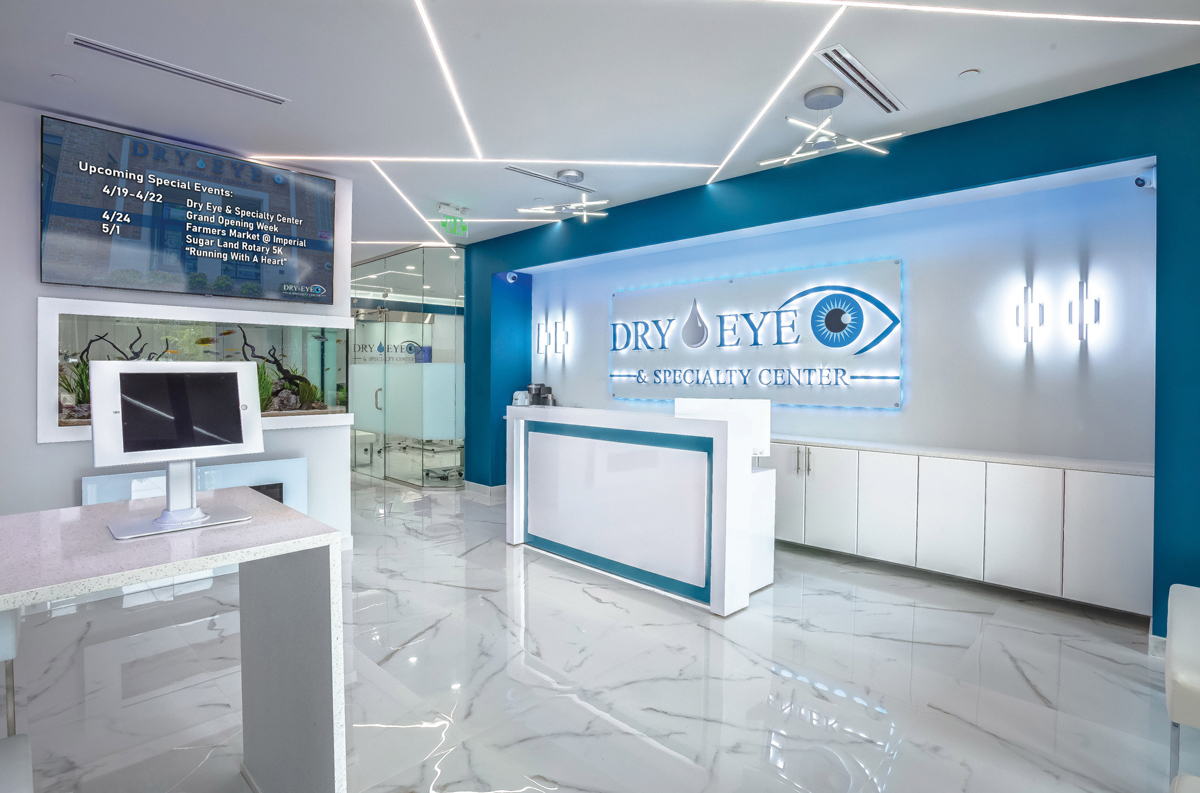
Cutting-edge was one of the first words used to describe our second runner-up, Dry Eye & Specialty Center, due to its modern and futuristic feel and advanced technology incorporated in all aspects of the office.
 |
| Dry Eye & Specialty Center. Click image to enlarge. |
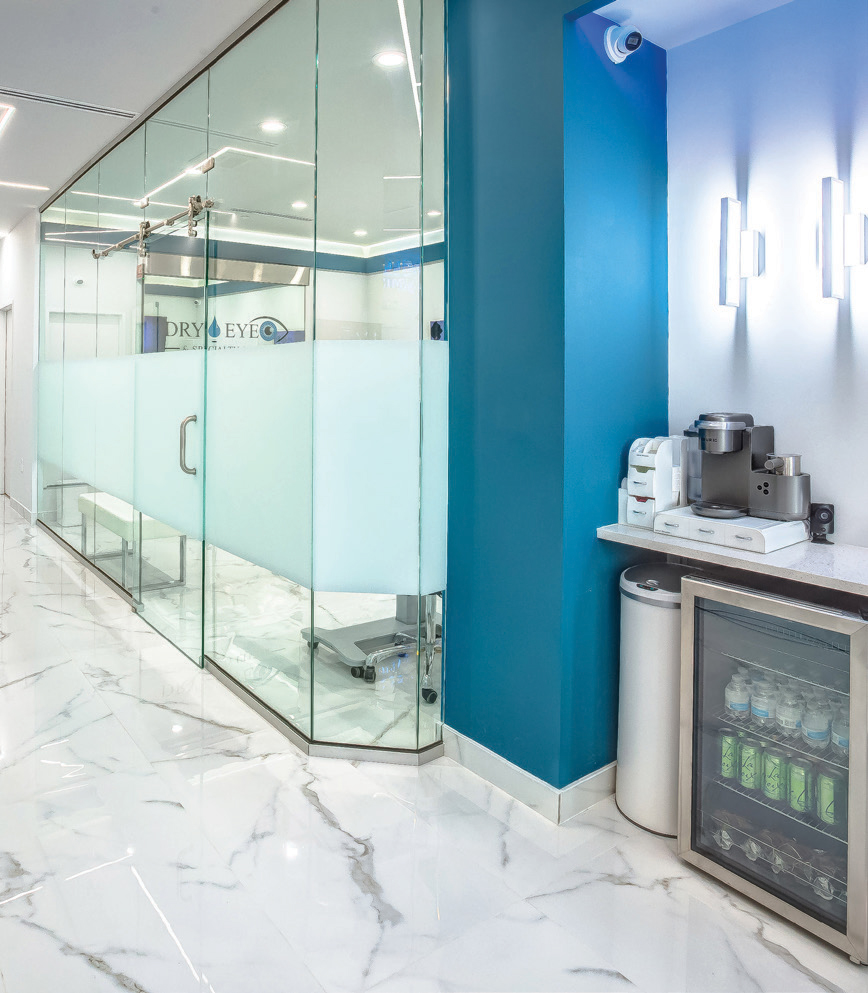
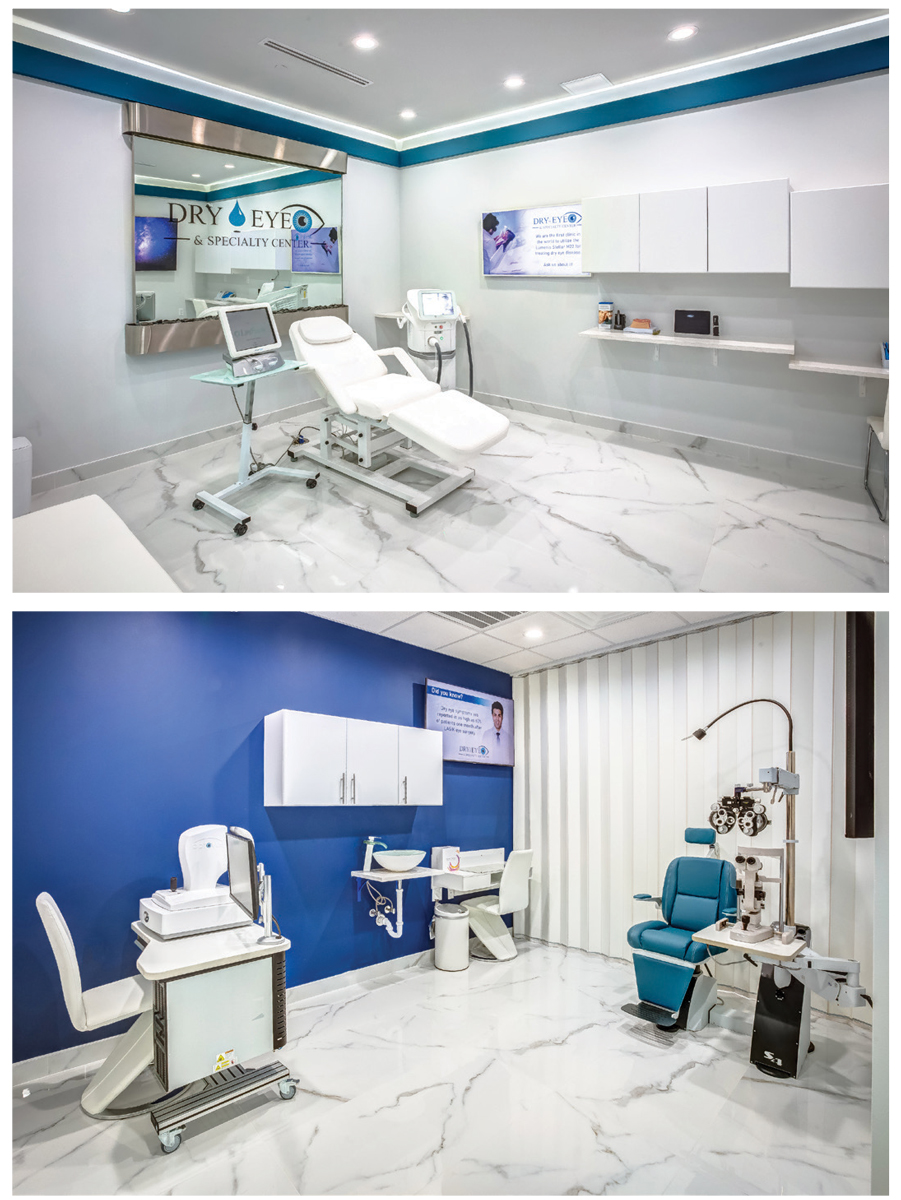
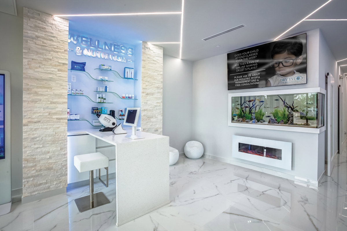
White and blue are the only colors used, giving the space it a clean, pristine look throughout, with white floors, unique light fixtures and a treatment room surrounded by glass that immediately catches your eye.
“This style instills confidence that they are on the cutting edge,” notes judge Dr. Rob Szeliga. “I like the choice of colors and how they are incorporated throughout the office. It’s a very sleek, clean and modern look.”
The glass-walled treatment area was specifically designed with an ergonomic exterior that prevents IPL light from shining through during treatments.
“[It] has an iPad and large HD screen that are wirelessly connected to have an interactive session describing their ocular health with every patient encounter,” Dr. Inayatali notes.
 |
| Dry Eye & Specialty Center. Click image to enlarge. |
“As patients begin treatment, a waterfall behind the chair creates an ambiance that is relaxing to ease any anxiety. The exam room is located directly across from the treatment room so the doctor and technician can switch for added efficiencies using in-office communication software (Bluenotes) to keep our team linked together and reduce wait time.”
Dr. Inayatali also integrated technology—while improving functionality—by creating an app that generates a QR code with information that patients can take home regarding any ocular conditions that need to be managed. Gone are the days of badly photocopied patient handouts strewn about the waiting room.
As much as the technology has enhanced the patient experience and played a role in changing the entire look of the office, Dr. Inayatali says the aesthetics are the highlight of the overall experience, with people passing by often coming inside just to take pictures of the space.
“Our in-ceiling LED lights and waterfall create a contemporary appeal that has attracted patients from all over the nation, plus Mexico and Canada,” he explains.
 |
Dry Eye & Specialty Center. Click image to enlarge.
|
Honorable MentionsThese four offices stood out by crafting unique expressions shaped by their personalities and practice setting.
|
