These featured practices were chosen from numerous entries as reflecting the best overall approach based on design, efficiency, style and technological integration. Using feedback from our trio of qualified judges, we crowned one winner and two runners-up, all of which have enjoyed the rewards of a new build.
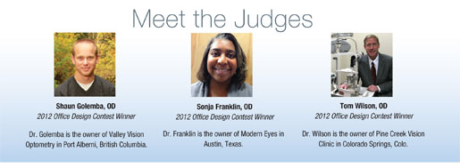
We called on last year’s winners to judge the entries for 2013. Using their own field experience and eye for design, they scored entries based on pictures and detailed entry forms in which applicants explained how each new build improved functionality, incorporated new optometric equipment, considered ergonomics in the layout and achieved an aesthetically pleasing new look.

So, let’s meet our winners!
Winner: Eye Elements
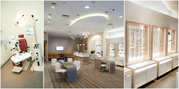
When you have a creative project on your hands, inspiration can come from anywhere. And looking beyond optometry sometimes offers a fresh approach. For Teri Hung, OD, owner of Eye Elements in Dunwoody, Ga., inspiration came from the luxury, efficiency and creative beauty of the restaurant industry. She searched for interior design photos from restaurants all over the world and pinned her favorites to a Pinterest board. Atlanta designer James Beaty brought that board to life in a new office space of more than 3,500 usable square feet.
Patients who walk into this L-shaped office hear ambient music from the integrated in-ceiling speaker system and can easily browse the optical area without creating a logistical logjam with people waiting for eye exams. A centralized pre-testing area and contact lens area allows multiple doctors and multiple patients to be examined and escorted to any of the exam rooms in this large practice.
“This is a very nice ‘open concept’ office with good use of an accent color,” contest judge Sonja Franklin, OD, says. “The office has great curb appeal and the use of window displays create interest to pedestrians.”
Indeed, Dr. Hung says some people walk into the new office just to enjoy the aesthetics.
“Any time you put a lot of time, money and effort into something, you hope that it will be successful. We created a practice of our dreams and are thrilled that we have a space for all of our patients and staff to enjoy,” Dr. Hung says. “New patients are intrigued by the space, while established patients are pleasantly surprised. The design of the office represents who we are and that we pay careful attention to details.”
The office expansion includes upgraded computer and clinical equipment, a new exam lane and server integration that connects Dunwoody to another location in Roswell.

Getting in Good Shape
At first, the owners were concerned that their L-shaped office would pose a design challenge.
“Many office spaces are linear, but our office space was more unique,” Dr. Hung says. Turns out, the L shape was ideal: “It works perfectly for our needs. Our L-shaped space allows us to differentiate the optometric clinic from the optical.”
With a centralized pre-testing and contact lens area, patients can move easily throughout the practice.
“Placing the optical near the front entry allows walk-in shoppers to browse products, and the front desk is conveniently positioned to serve both patients in the clinic and buyer in the optical, with an open view to the entire front office,” she says.
First Runner-Up: St. John's Eye Associates
Every inch of the 1,900 square feet of St. John’s Eye Associates was designed with patients in mind, from the pleasant office environment to the flat-screen exam room TVs that allow for easy patient viewing, according to owner Sharokh Kapadia, OD. The office layout includes a walk-through between the inner business office and contact lens room, with ergonomically designed seating in the exam rooms for better comfort and posture.
“Patients really like the clean, neat look to the practice,” says Dr. Kapadia, who also owns a practice in St. Augustine, Fla. “The LED lighting in the optical really enhances the way the eyewear looks when it’s on the frame boards.”
For contest judge Shaun Golemba, OD, the remarkable lighting was one of the most notable features of Dr. Kapadia’s entry.
“I like the high-end feel,” Dr. Golemba says. “I think all of the elements coordinate. Everything is cohesive. I like the contrast of the dark cabinets from the white walls and light floor, and the big-screen TV in the exam room would be very practical for viewing the various imaging devices we use these days.”
 Dr. Kapadia also invested in dry-air technology that releases fragrance without sprays, aerosols or heated oils, so one of the first things his patients notice is the smell.
He says he spent more than a year planning and building the practice, but watching it grow over the past 12 months has been its own reward, especially as the first eye care provider at his second location.
When you’re the first ECP, “it’s slower at first, but patients appreciate the fact that you have spent your time and resources to open a practice to take care of their needs.”
Better, Brighter Refractions
One of Dr. Kapadia’s goals was to offer the best technology possible, so he invested in two automated refracting lanes that allow for quick and more accurate refractions.
“Patients also benefit because they don’t have to be asked the same, ‘What’s better, one or two?’ as much,” he says.
The refractions are done in a well-lit room, rather than a darkened one, which makes for a better atmosphere.
Second Runner-Up: Eye Columbus
Some patients of Eye Columbus have visited the practice ever since it was originally founded in 1967. Craig Miller, OD, felt it was time for a substantial redesign that rewarded the loyalty of older patients and met the expectations of the newer ones. He delivered on that vision with the recent overhaul of Eye Columbus’s 3,760-square-foot location.
Dr. Miller drew inspiration from eye-catching retail spaces and input from his staff to create an atmosphere that seamlessly married the optical retail experience with the optometric clinical experience.
“Although it was a great challenge, I feel we accomplished that completely,” Dr. Miller says.
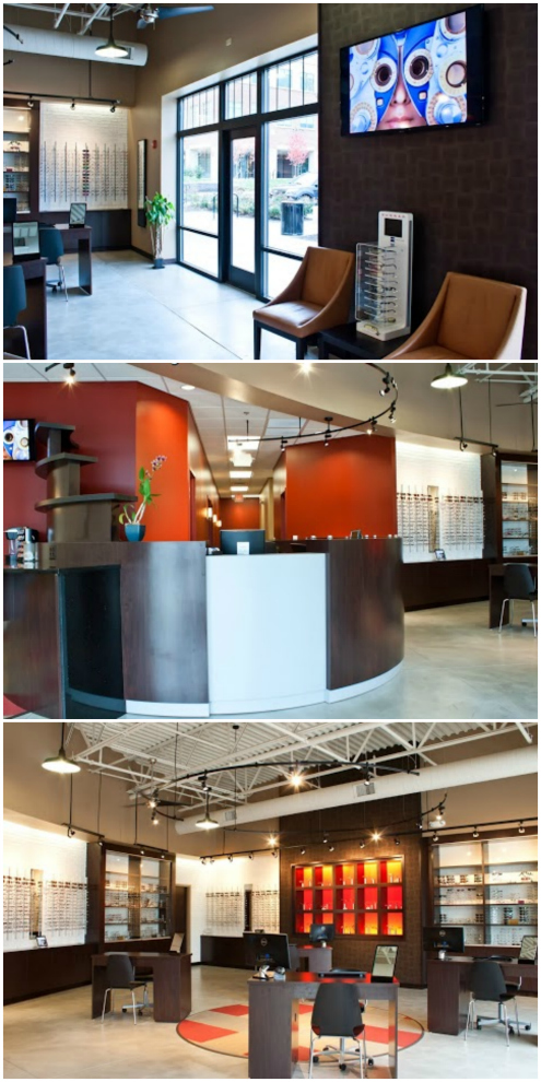
The use of dark wood and shades of orange accents create the foundation for the warm, welcoming environment of Eye Columbus.
Contest judge Tom Wilson, OD, said Eye Columbus was notable for its “creative look and open feeling.”
The practice moved from a single exam room office with two dispensing desks to a three exam room office with four dispensing desks, which dramatically improved quality of care. Dr. Miller also incorporated an open design lab with multiple entrance points to improve the flow for opticians.
During this process, Dr. Miller also kept the future in mind, trying to predict how the practice will change over the next 10 years so he can continue offering updated service.
“Patients and guests are truly wowed when they walk into the front door, which is great, but the best compliment is when patients acknowledge that the level of care is top-notch,” he says.

Ergonomically Sound Practice
In the exam rooms, a single monitor is attached to a wall-mounted swivel so that the doctor or scribe can use it. A single computer controls the letter chart, EHR, interactive patient education software and Internet.
“Dual keyboards enable the doctor and the scribe to input material, allowing the doctor to face the patient most of the exam and verbalize what needs to be written down,” Dr. Golemba says.
New drawers in the exam rooms improve ease of access to equipment and make it easier to keep the space tidy:
• The first drawer holds pretest tools.
• The second contains the doctor’s tools.
• Trial frames are found in the third drawer, which is positioned at arm’s length when standing, so the doctor doesn’t have to bend to access them.
• Brochures and other information materials are located in the fourth drawer.
The business office comfortably holds five workstations and an overhead projector for business meetings and distance-education webinars.

