My architectural firm has been designing eye care offices for more than 30 years. In just the last 10 years, weve designed more than 125 such facilities, both in the United States and abroad.
Although each project has its unique constraints, weve learned a few design methodologies that we attempt to incorporate into every eye care project. For instance, weve learned to design the layout of the office more for the convenience of the technicians than the optometrist (or ophthalmologist). Weve also realized that the waiting room and the optical area should not only be adjacent, they should feel like one single space. (More on these ideas later.)
We have good reasons for these design methodologies. Theyve come from years of planning innovative facilities that integrate new design concepts. Unfortunately, a few such concepts failed in the process. But let our loss be your gain, letting you avoid a design approach that wont work.
In this article, Ill present a few of our most important and successful design methodologies for the eye care office. Whether youre building a brand new facility or looking to improve your existing space, you can improve your office traffic, encourage more patients to get eyewear from your dispensary and even make patients happier by incorporating these ideas into your layout.
The Waiting Game
Dont let your patients just sit there. Instead, make your waiting room work for you. Some suggestions:
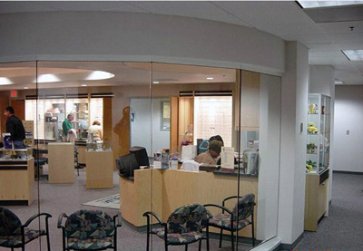
Combine your waiting room and optical area. The distance between your waiting room and your dispensary should be kept to a bare minimum. Simply put, your patients shouldnt be able to differentiate the two areas; they should feel as though they are in one space.
Why? The relationship between the waiting room and the optical is critical to encouraging patients to visit your dispensary. This directly contributes to the financial success of your practice.
This minimal separation between your waiting patients and your dispensary should include patients who are dilating. Most of the eye care offices we design no longer have a separate waiting room for dilating patients in back of the examination area. Instead, we place the only waiting room so close to the technician station and exam lanes that it functions just fine for patients waiting to be seen and those who are dilating, yet it is still adjacent to the dispensary.
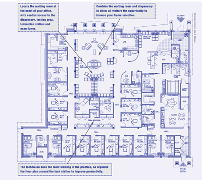
Make the waiting room the center of your office. As far as your patients are concerned, the waiting room is the center of their ophthalmic universe. So, put your waiting room at the center of your office. Think of your office as a wheel; the waiting room serves as the hub of the wheel, and all other areas are the spokes. From the waiting room, patients should have immediate access to the optical shop, the testing area, the technician station and the exam lanes.
 |
|
Dont create a second waiting room in the back for dilating patients. Have all patients wait in the main waiting room to have a peek, if they choose, at the dispensary. |
This configuration also allows opticians to chat with family members during slow periods. If your optician has the time, he or she can easily enter the waiting room and ask someone who is wearing glasses if he or she would like them adjusted and cleaned. This interaction often leads to discussions about new technologies in frames and lenses as well as serendipitous sales from individuals who arent even patients yet. Quite simply every patient or family member who enters your facility should not only know you have an optical shop but should be subtly tempted to spend time there. (See floor plan below.)
 |
Office design, in a sense, is analogous to a football game. Although you might prefer to think of yourself as the quarterback of an ophthalmic team, you are actually the running back. Your job is to travel as fast as possible from one exam lane to the next so that you can see as many patients in as little time as possible.
This productivity helps grow the practice. When it comes to generating income, you are far ahead of any technician or optician in the practice. So, making yourself as efficient as possible makes a lot of economic sense and should be a high priority.
 |
|
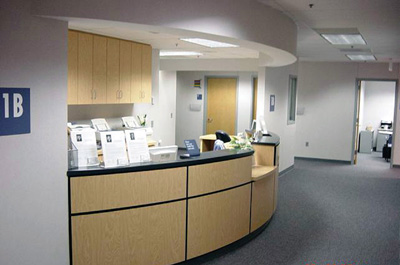
The technician does the most walking in the practice, so organize the floor plan around the tech station to improve productivity. |
Remember, the quarterback is in the center of the field, while the running backs are off in the wings waiting for a handoff. You control limited spacesexam lanes, some testing functions and an area to dictateto be successful. The technician, however, must control the entire playing field: the waiting room, all the exam lanes, all testing functions, the dispensary, the technician station and, of course, patient flow in and out of the facility.
The technician station should be centrally located and should be visiblyand physicallyaccessible from the exam lanes and dictation areas. This allows technicians to:
Appropriately screen patients.
Let you know which patients are ready to be seen and where these patients are. If the technician is out of the line of sight, how can he hand off the patient to you? How can a quarterback hand off to a running back if the two cant even see each other?
Respond directly to any instructions you may have.
To complete these functions, the technicians need to be square in the middle of the field. Dont push them off into some corner of the office as I so often see in existing facilities.
If the technician (quarterback) is successful, you (running back) will be too, and your practice (ophthalmic team) will grow (score!). (See floor plan for location of the technician station, above.)
Break Up Your Large Office
If your practice employs many optometrists and/or ophthalmologists, dont make the mistake of simply increasing the overall size of your office to adjust for the increased patient load. The traditional health-care office designwith the waiting, reception, cashier/reappointment and business office functions up front and the exam, testing and procedure functions in the backsimply does not work for a large-scale practice. Just imagine the poor patient who opens the front door and is confronted with a 70- to 90-seat waiting room and three to six receptionists. This complexity may be overwhelming to patients, and calls for a redesign.
Although patients may like the concept and services of a larger group, they dont want to be treated like a number. The traditional design does exactly that. Its hard to believe, but Ive seen practices that actually have an exam lane #24. Imagine being the poor patient who gets escorted to that room. No doubt that patient thinks, Number 24? Man, it will take forever to be seen in this place.
 |
|
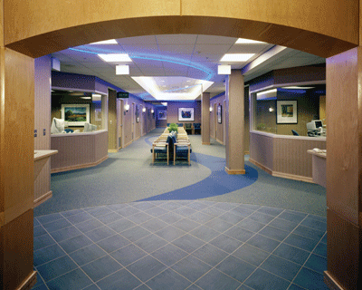
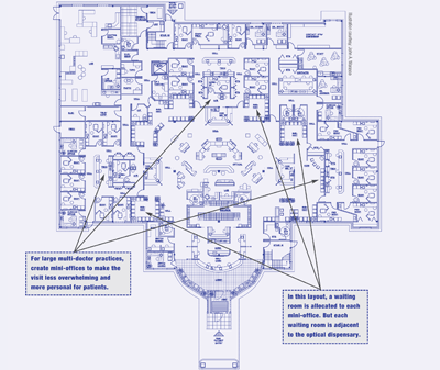
For a large multi-doctor office, break the floor plan up into a few mini-officeseach with its own front desk and waiting area. Its more personal and less overwhelming. |
Further, a large traditional office creates undue travel distances for the technicians. By placing the waiting room up front and the exam spaces in the back, your technicians have no choice but to repeatedly travel this distance all day long.
Space without intelligent design is a waste of time. Good design does not take additional space; it simply allocates this space throughout the facility in a more effective way. If you have a large multi-doctor practice, try creating mini-offices within a larger facility instead of designing one large traditional office. In other words, separate the doctors into groups of two to four and give each group its own front office (reception, cashier/reappointment and waiting room). The advantages to doing so create a win-win-win situation:
Youve easily solved the travel problem. Now, the patients travel, saving your employees much time. This, in turn, increases their efficiency and lowers your costs.
You can see patients on a more intimate scale, hopefully creating happier patients.
By placing these mini-offices around the optical shop, each waiting area (and thus each patient) has the direct access to the dispensary as discussed above. (See floor plan, below.)
 |
Mr. Marasco is a member of the American Institute of Architests (A.I.A.) and is certified by the National Council of Architectural Registration Boards (N.C.A.R.B.). He is the owner and principal of Marasco & Associates Healthcare Architects & Consultants, based in Denver. He has lectured and written numerous articles on the design of health care facilities.

